
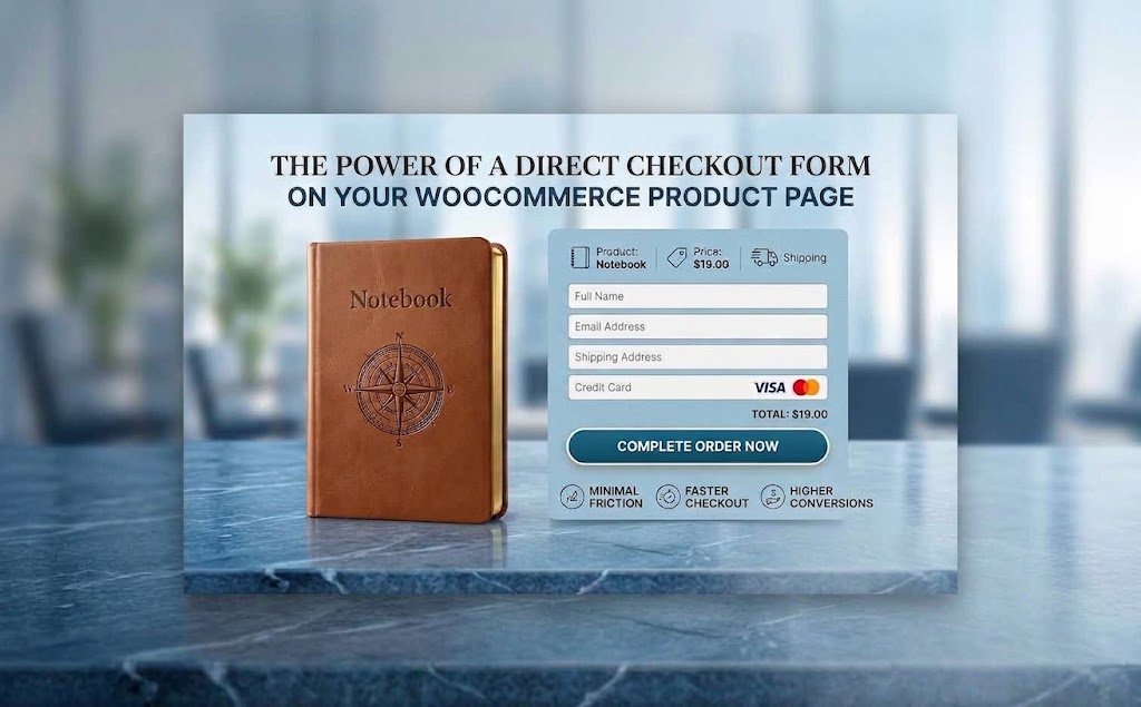
When a customer decides to buy a product from your online store, the purchasing process should be as simple and straightforward as possible. Yet many WooCommerce stores still send customers through several pages before they can complete an order. A direct checkout form placed on the product page can shorten that journey and keep the purchase focused on the product the customer already wants.
Why Does the Checkout Experience Matter?
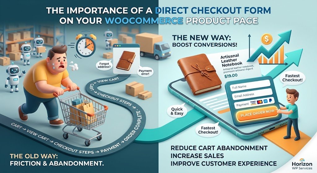
A traditional WooCommerce journey may look like this: Product Page u2192 Add to Cart u2192 Cart u2192 Checkout u2192 Enter Information u2192 Place Order. Every extra step can introduce friction. A direct checkout form brings essential purchasing actions closer together, allowing customers to review the product, choose the quantity or variation, enter their details and place the order from the same page.
When Is a Direct Checkout Form a Good Choice?
The checkout is one of the final stages between purchase intent and a completed order. A beautiful product page cannot compensate for a confusing or unnecessarily long purchasing process. The objective is not simply to reduce clicks; it is to remove steps that do not add value and make the next action obvious.
How to Design a Product-Page Checkout That Converts
This approach can be particularly useful for stores selling individual products, stores that receive traffic from advertising campaigns, landing-page products and businesses using Cash on Delivery. It can also work well when customers normally purchase one product or a small number of items. Traditional carts remain useful when shoppers frequently combine many products into one order.
A product-page checkout should feel like a natural part of the page rather than a form added as an afterthought. Keep the most important information visible: product, price, variations, quantity, customer details, shipping information and the final order button. Use clear labels, logical field order, comfortable spacing and a strong mobile layout.
Check our Pluguins Design & Setup services !
Common Mistakes to Avoid
Mobile usability is especially important. Fields should be easy to tap, the form should not require unnecessary scrolling and customers should immediately understand what information is required. For COD stores, only collect the information needed to confirm and deliver the order instead of filling the screen with unnecessary fields.
Building a Better WooCommerce Buying Experience
The checkout should support the product information instead of replacing it. Customers still need clear images, benefits, specifications, pricing, shipping information and trust elements before they are ready to order. The checkout section should then provide a clear path from that decision to the completed order.
Real Results: From Visitors to Paying Clients
Conclusion
How Horizon WP Services Can Help You Build a Direct Checkout That Converts
If you’re ready to turn your visitors into paying customers without the extra clicks, partner with Horizon WP Services. We specialize in building WooCommerce websites designed to reduce friction, streamline the buying journey, and increase sales — beautifully and effectively.
At Horizon WP Services, we:
Build custom WooCommerce product pages tailored to your specific sales goals and audience.
Integrate direct checkout forms optimized for standard payments or Cash on Delivery (COD).
Optimize your store for speed, mobile usability, and a seamless user experience.
Continuously refine your purchasing journey to minimize cart abandonment.
Whether you’re launching a single flagship product or driving ad traffic straight to your store, our team ensures your WooCommerce buying experience isn’t just functional — it performs.
👉 Let’s turn your visitors into customers !
Looking for professional WordPress security services? Horizon WP Services provides comprehensive security solutions that protect your business from cyber threats. Contact us today for a free security consultation and vulnerability assessment.
Latest Blogs
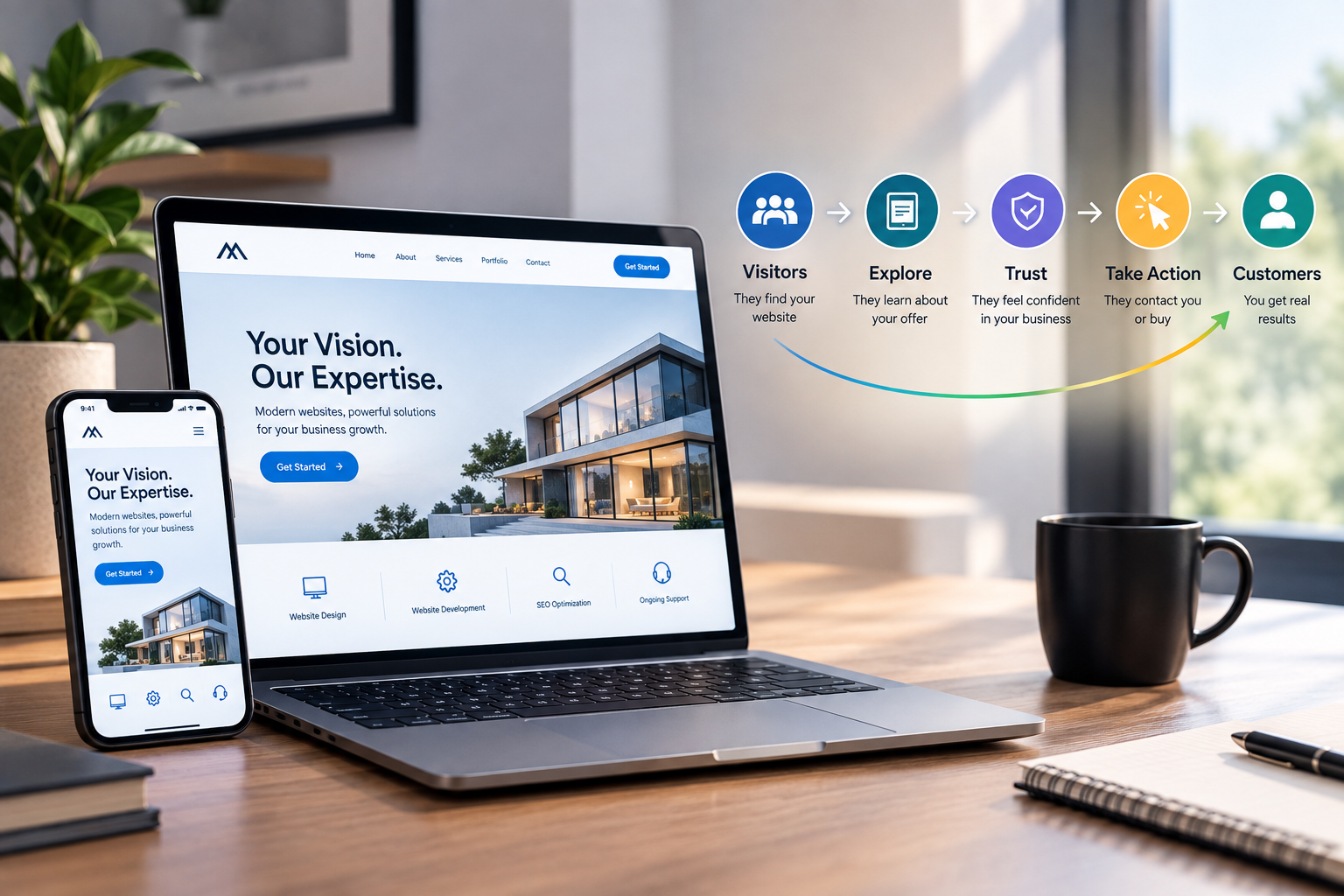
Why Your Website Gets Visitors but No Customers
How Much Does a Professional WordPress Website Cost?